

Showing posts with label american artists. Show all posts
Showing posts with label american artists. Show all posts
Monday, November 18, 2013
Jeff Koons’ Balloon Dog (Orange) was sold for $58,4M and set a new record
During the Post-War & Contemporary Evening Sale at Christie's New York on 12 November, which totalized $691,583,000 (including buyer's premium), Jeff Koons’ Balloon Dog (Orange) realized $58,405,000 achieving world auction record for a living artist.
Signed and dated 'Jeff Koons 1994-2000' (on the underside), Balloon Dog (Orange) is a 121x143x45in (307.3x363.2x114.3cm) mirror-polished stainless steel "inflatable" sculpture with a translucent colour coating.
This work is one of five unique versions (Blue, Magenta, Orange, Red, Yellow), part of the highly acclaimed Celebration series of paintings and sculptures that Koons instigated in the early 1990s.
The one-ton metal balloon sculpture is formed by 60 parts welded together to produce the simple, but very suggestive shapes, as well to convey an illusion of weightlessness. Jeff Koons worked closely during years with a specialist foundry in California perfecting the meticulous colour coating that appears to hover abouve the stainless-steel surface.


Monday, August 20, 2012
Nature in America: Taming the Landscape

Until the 26 of this month, you are still on time to see a major exhibition of paintings, drawings, photographs, and prints—many rarely or never shown—of the American landscape. From the works by early artists of the Hudson River School through the mid-twentieth-century ones, before abstract expressionism changed the artistic dynamic.
Presented by the Frances Lehman Loeb Art Center, "Nature in America: Taming the Landscape," comprises forty-four works on view, of which forty-two belong to the Art Center's permanent collection.
The exhibition is arranged throughout three galleries, as to offer a better perception to the visitors, of the different interpretations of the American landscape from the depiction of the largely wilderness, passing through more intimate scenes after the Civil War, and until the early-20th-century with works inspired by the art of European modernists.
The first part, entitled "The Young Nation and Expansion: Domesticating the Wild," includes among other renowned artists, the names of Aaron Draper Shattuck, Andrew Joseph Russell, Frank Jay Haynes, Jervis McEntee, Thomas Doughty, Thomas Cole, and William Henry Jackson.
Mountains, lakes, waterfalls, that is to say, a wilderness that is becoming more rare in Europe, is offered to the artists of the Hudson River School and to the early Western photographers.
Their paintings convey a sublime and romanticized landscape inspired by the dramatic American wilderness.
After this, the visitor is taken to "After the Civil War: Softening the Face of Nature," a period during which a considerable number of painters, printmakers, and photographers in the United States, started creating more atmospheric up-close and intimate depictions of nature, with growing emphasis on strong passages and veils of color.
American painters start following the style of artists such as Jean-Baptiste Camille Corot and Theodore Rousseau, depicting an informal and vibrant landscape. It is also during this time that artists embrace a new way of painting, brought by those working in Europe: En Plein Air
These paintings often show the influences of the French Impressionsists, exhibiting luminous and color-saturated palletes.
In this section, one can find the works of Abbott H. Thayer, Coswell Rubincam, Daniel Garber, Dwight William Tryon, Henry Wolf, George Inness, John Francis Murphy, and Milton Avery among others.
The exhibition ends with "The Progressive Era through the World Wars: Breaking Nature Apart."
In this part, one can perceive the depiction of masses, planes paterns and colours in the interpretation of the landscape. A style inspired by Matisse, Picasso and other European Modernists.
It's the first half of the twentieth century, a period of reformist politics and new ideas in the arts.
Among the artists included in this section, some from the Woodstock Art Colony, are the renowned names of Andrew Dasburg, Ansel Adams, Arthur Dove, Ernest Fiene, John Marin, Rosella Hartman, and William Zorach.
The exhibtion "Nature in America: Taming the Landscape" is sponsored by the Evelyn Metzger Exhibition Fund and can be visited until August 26,2012 at the Frances Lehman Loeb Art Center, located at the entrance to the historic Vassar College campus.
Admission is free and open to the public. All galleries are wheelchair accessible.
The Art Inquirer consulted the Dutchess County Tourism website as a resource for this article
Saturday, November 19, 2011
"Youth and Beauty: Art of the American Twenties" at the Brooklyn Museum

Through January 29, 2012, the Brooklyn Museum, NY, is showing a major exhibition about the art in the American 1920's, a decade that followed the horrors of World War I and has indelibly marked the popular imagination as the age of flappers and Fords. It was also the time of Jazz, Prohibition and F. Scott Fitzgerald.
The "Youth and Beauty: Art of the American Twenties" offers not only a chance to see the work of celebrated artists, but also a comprehensive look at the themes and subjects painted at the time - often causing surprise to the viewer - and how artists expressed their opinions and interpretated through their works, a decade fuelled by a growing economy but also a riotous one.
Organized by Teresa A. Carbone, Andrew W. Mellon Curator of American Art, Brooklyn Museum, the exhibition shows 140 works by sixty-eight painters, sculptors, and photographers who explored a new mode of modern realism, including the names of Thomas Hart Benton, Imogen Cunningham, Charles Demuth, Aaron Douglas, Edward Hopper, Gaston Lachaise, Yasuo Kuniyoshi, Luigi Lucioni, Gerald Murphy, Georgia O’Keeffe, Alfred Stieglitz, George Bellows and Edward Weston.
Free tours lead by a Museum Guide will take place on the 26 and 27 of November, and a panel discussion on "Gender and Sexuality in the Harlem Renaissance" can be attended on December 10.
A free evening tour of the exhibition lead by Curator of American Art Teresa A. Carbone, will take place on December 15 and on the 22 of the same month, visitors will have the opportunity to attend a free evening tour of the exhibition.
A teacher resource packet is available for download.
Sunday, October 16, 2011
Win a visit to Danny Heller's studio in L.A.

Born in Northridge, CA in 1982, Danny Heller holds a B.A. in art with an emphasis in painting by the College of Creative Studies at the University of California, Santa Barbara.
After capturing Santa Barbara’s surf landscapes during his formative years, Danny started focusing his attention into the retro iconography characteristic of mid-century Los Angeles.
Now working in his studio located in Silver Lake, Danny concentrates on chronicling Modern American imagery, depicting the architecture, design, and car culture found in Southern California.

His paintings have been shown through individual and colective exhbitions and published in art magazines.
Danny Heller's work has been acquired by the Foundation Colas, Boulogne-Billancourt, France and by the Long Beach Museum of Art, Long Beach, CA.
In 2008, Danny gave an interview to the Art Inquirer, sharing his approach to art and part of his techniques.
Now, after three years, The Art Inquirer and Danny Heller are collaborating again to provide a magnificent experience for two readers of this blog: a visit to his studio in Silver Lake, LA.
Whether you are an emerging or seasoned artist, or an art lover, this will be a great opportunity to get directly in touch with an artist at his studio.
During the visit you'll be able to ask Danny about his development as an artist, how he approaches his favourite themes and subjects, and even get some tips on how to improve your painting techniques.
As mentioned before, the visit is for two readers of The Art Inquirer.
Here's how it's going to work:
If you're interested in participating in this visit, just leave your comment here and a link to a simple post on your blog about this event, so that I may easily contact you in case you win. That's all you have to do.
The two winners of this event cannot be relatives.
After randomly selecting the winners, The Art Inquirer will contact them directly and will ask them to provide a contact.
The visit will take place in November, during the morning or afternoon, and at the same time for both winners. The specific day and timing will be arranged between Danny and the winners, with whom he'll get in touch.
Danny Heller and The Art Inquirer will do their best to provide you the best possible experience during your visit to his studio.
As long as all the parties agree, they are free to arrange the visiting parameters as they wish, including changing the month of the visit. The Art Inquirer does not pose any final conditions.
Eventual traveling and personal expenses are responsability of the winners.

The artist's latest individual exhibition, entitled "The LAX Series," was inaugurated yesterday at the George Billis Gallery in LA and will run until November 12.
Disclaimer: This studio visit is not a sales visit. Danny Heller's paintings can be acquired through galleries that represent him.
Sunday, August 14, 2011
$20 Million donated by Walmart to sponsor admission for the Crystal Bridges Museum of American Art

Given over a period of five years, the grant of $20 Million donated by Walmart to the Crystal Bridges Museum of American Art, Bentonville, Arkansas, is destined to sponsor the admission to the museum. Prior to the grant, an admission fee of $10 was being considered for adults.
Walmart president and CEO Mike Duke said "While saving people money is how we make people’s lives better every day, we realize that things like listening to your favorite song, seeing a beautiful painting or laying eyes on an amazing sculpture make our lives better, too."
"One of the greatest challenges for museums today is finding ways to remove barriers to community participation, including admission charges,” said Don Bacigalupi, Crystal Bridges executive director."
In order to adress social, economical and cultural barriers that often prevent diverse audiences from participating in the arts, the museum has set a Next Generation Fund.
Promoting environmental sustainability is also one of the priorities of this fund created by community-minded philanthropists.
Founded in 2005 by the Walton Family Foundation and set to open 11-11-11, the Crystal Bridges Museum of American Art has in its mission to actively collect, exhibit, interpretate, and preserve the representative works that illuminate the history, heritage and artistic possibilities of America.
Its collection features American masterworks dating from the Colonial era to contemporary times and will be on view to the public year-round. An ever-changing array of special exhibitions featuring art from museums and collections throughout the region, the nation and abroad, will also be organized.
Designed by world-renowned architect Moshe Safdie and located in Northwest Arkansas, the Crystal Bridges Museum of American Art comprises series of pavilions nestled around two creek-fed ponds, with house galleries, meeting and classroom spaces, and a large glass-enclosed gathering hall.
A museum store designed by Marlon Blackwell welcomes visitors who wish to take a souvenir from their visit to this excellect cultural place, while a café on a glass-enclosed bridge overlooking the ponds will make the delight of those who wish to take a pause.
Sculpture and walking trails will link the Museum's 120-acre park and gardens to downtown Bentonville, Ark.
The Grant donated be the Walmart Foundation will cover cost of admission for all Museum guests.
Monday, July 11, 2011
Phaidon Press presents "Carl Andre: Things in Their Elements" by Alistair Rider

Phaidon Press has launched an enlightening monograph offering a comprehensive and insightful look at the career of groundbreaking American minimalist sculptor Carl Andre.
With unique access to Andre’s studio and personal archives, its author, academic and Carl Andre expert Alistair Rider, examines Andre’s role as a sculptor and installation artist.
The book "Carl Andre: Things in Their Elements" includes never before published sketches and writings, many contemporary installation photographs, and works in private collections and those in major international museums.
Rider also presents the artist's rarely seen poetry and photography that form an integral part of his oeuvre.
Andre's concrete poetry has exhibited in the United States and Europe, part of which is in the collection of the Stedelijk Museum in Amsterdam.
Born in Quincy, MA, on September 16, 1935, Carl Andre studied art at Phillips Academy in Andover, MA. There he became friends with Hollis Frampton who later introduced him to Constantin Brâncuşi.
From 1958 to 1960, Andre shared a studio with former classmate from Phillips Academy, Frank Stella.
Although his early work in wood may have been inspired by Brâncuşi, his conversations with Stella about space and form led him in a different direction.

Recognized both for his ordered linear format and floor-based grid-like formations of breeze blocks, Carl Andre makes his first public debut in 1965, in ‘Shape and Structure’ curated by Henry Geldzahler at the Tibor de Nagy Gallery.
The following year, New York’s Jewish Museum included his controversial LEVER in its important exhibition ‘Primary Structures’.

In 1969 Andre helped organize the Art Workers Coalition.
His first solo show takes place at the Solomon R. Guggenheim Museum in 1970.
Carl Andre lives and works in New York, and his work features in leading collections worldwide.
Alistair Rider is a Lecturer in Art History at the University of St Andrews. He teaches classes on modern sculpture, critical theory, New York modernism and experimental art of the 1960s.
Saturday, May 21, 2011
Weekend With the Masters Workshop & Conference 2011 (Monterey, California)
Now in its third year, Weekend With the Masters is an internationally renowned art event that offers an enlightening experience through contact with some of the most famous fine artists worldwide.
Presented by the American Artist magazine, this year's edition will take place in the Portola Hotel & Spa at Monterey Bay, California (September 7 through 10, 2011).
During the official four days of the event - Sunday is considered an extra day - several workshops and demonstrations will provide instruction on art techniques approaches to certain themes and subjects. Lectures and panel discussions conducted by the masters themselves will give you insightful ideas for your next art project and even for your artistic career.
A series of special and evening events will take place, starting on Wednesday, September 7, where after the opening reception ((6:30PM-9:30PM), David A. Leffel will kickoff the first official night of Weekend With the Masters by moderating a panel discussion titled “The Objectivity & Subjectivity of Art: Is Beauty Really in the Eye of the Beholder?”
His panelists include Richard Schmid, Jacob Collins, Rose Frantzen, George Gallo, Daniel Gerhartz, Quang Ho, and a curator from the de Young Museum, in San Francisco.
On September 8, the notable painter and instructor Richard Schmid, keynote speaker at Weekend With the Masters, will conduct a live portrait demonstration of Los Angeles artist Alexey Steele, at the same time engaging in conversation about various topics related to the current and future state of representational art.
Attendants will not want to miss the event on Friday evening, September 9, when Quang Ho and Daniel Sprick will carry a side-by-side painting demonstration of the same model, where both artists will show how they convey their particula interpretion of the same model and depict it using their techniques and artistic approaches, both realistic but different, either resulting in a more expressionistic result or in a tightly controlled contemporary realism influenced by an Old Master-like technique.
On Semptember 10, a special fund-raising silent auction that will include drawings, paintings, DVDs, books, and art materials donated by master instructors, local organizations, and event sponsors—will be donated to the California Art Club’s Mentor Program, which provides opportunities for artist-members under the age of 30 to connect with and learn from their signature members.
Although Weekend With the Masters officially ends on Saturday, September 10, participants will have the opportunity on Sunday (9AM-12PM) to have a painting they created during the event critiqued by one of the instructors and receive individualized feedback.
Scott Burdick, Quang Ho, Susan Lyon, Dan McCaw, and Dan Thompson are the five instructors leading this ending critique.
Twenty seats will be available on each session for those who want to observe but not participate.
The registration for the Weekend With the Masters Workshop & Conference 2011 is available online until the event dates or until the workshops are full, and are reserved on a first-come, first-served basis.
You may consult this page to learn more about participant information and FAQs.
If you are really interested in participating, The Art Inquirer advises you to read everything carefully, take notes and sign up the Weekend With the Masters e-mail updates.
Read about the Weekend With the Masters Intensive: New York, taking place in June.
This article contains excerpts from original texts (c) Interweave
Presented by the American Artist magazine, this year's edition will take place in the Portola Hotel & Spa at Monterey Bay, California (September 7 through 10, 2011).
During the official four days of the event - Sunday is considered an extra day - several workshops and demonstrations will provide instruction on art techniques approaches to certain themes and subjects. Lectures and panel discussions conducted by the masters themselves will give you insightful ideas for your next art project and even for your artistic career.
A series of special and evening events will take place, starting on Wednesday, September 7, where after the opening reception ((6:30PM-9:30PM), David A. Leffel will kickoff the first official night of Weekend With the Masters by moderating a panel discussion titled “The Objectivity & Subjectivity of Art: Is Beauty Really in the Eye of the Beholder?”
His panelists include Richard Schmid, Jacob Collins, Rose Frantzen, George Gallo, Daniel Gerhartz, Quang Ho, and a curator from the de Young Museum, in San Francisco.
On September 8, the notable painter and instructor Richard Schmid, keynote speaker at Weekend With the Masters, will conduct a live portrait demonstration of Los Angeles artist Alexey Steele, at the same time engaging in conversation about various topics related to the current and future state of representational art.
Attendants will not want to miss the event on Friday evening, September 9, when Quang Ho and Daniel Sprick will carry a side-by-side painting demonstration of the same model, where both artists will show how they convey their particula interpretion of the same model and depict it using their techniques and artistic approaches, both realistic but different, either resulting in a more expressionistic result or in a tightly controlled contemporary realism influenced by an Old Master-like technique.
On Semptember 10, a special fund-raising silent auction that will include drawings, paintings, DVDs, books, and art materials donated by master instructors, local organizations, and event sponsors—will be donated to the California Art Club’s Mentor Program, which provides opportunities for artist-members under the age of 30 to connect with and learn from their signature members.
Although Weekend With the Masters officially ends on Saturday, September 10, participants will have the opportunity on Sunday (9AM-12PM) to have a painting they created during the event critiqued by one of the instructors and receive individualized feedback.
Scott Burdick, Quang Ho, Susan Lyon, Dan McCaw, and Dan Thompson are the five instructors leading this ending critique.
Twenty seats will be available on each session for those who want to observe but not participate.
The registration for the Weekend With the Masters Workshop & Conference 2011 is available online until the event dates or until the workshops are full, and are reserved on a first-come, first-served basis.
You may consult this page to learn more about participant information and FAQs.
If you are really interested in participating, The Art Inquirer advises you to read everything carefully, take notes and sign up the Weekend With the Masters e-mail updates.
Read about the Weekend With the Masters Intensive: New York, taking place in June.
This article contains excerpts from original texts (c) Interweave
Tuesday, March 29, 2011
The Andy Monument by Rob Pruitt

Commissioned by Public Art Fund, NY, a nearly ten-foot-tall chrome finished sculpture of Andy Warhol created by Rob Pruitt, will be unveiled tomorow in the Union Square, Pedestrian Mall at 17th Street and Broadway, just outside the building that housed Warhol’s Factory for more than ten years in the 70s and early 80s, tomorow Wednesday March 30 at 11:00am.
Inspired by Warhol’s art and life and a tribute to the late artist, The Andy Monument will stand on the street corner, just as Warhol did when he signed and gave away copies of Interview magazine which he founded in 1969.
Based on a combination of digital scanning of a live model and hand sculpting, Rob's creation aims to represent Warhol as a ghostly, silver presence: a potent cultural force as both artist and self-created myth. The chrome figure wears his signature fright wig and carries a Polaroid camera around his neck. In his right hand he carries a medium brown bag, which Rob imagines to be filled with copies of Interview magazine.
In the likeness of what is becoming common these days, interaction through the use of technological devices and social media will be made possible.
The sculpture created by Rob Pruitt will stand in the Union Square, NY, until May 13, 2012 (updated).

Photo by James Ewing
Thursday, February 3, 2011
The Bronx Museum of the Arts: smARTpower

Administered by The Bronx Museum of the Arts, with the purpose of increasing the mutual understanding between the peoples of the United States and other countries through social and cultural values, smARTpower will send fifteen American artists abroad to work with local artists and young people around the world to create community-based art projects and develop programs in cooperation with local arts organizations in host countries including China, Ecuador, Egypt, Ghana, India, Kosovo, Lebanon, Nepal, Nigeria, Pakistan, the Philippines, Kenya, Sri Lanka, Turkey, and Venezuela.
The selected artists are required to address a full range of relevant subjects such as women’s empowerment, the environment, health, education, and civic engagement, which may be represented through several visual arts media, including but not limited to painting, sculpture, drawing, video, installation, photo-based work, public art, and interdisciplinary projects.
Artists are encouraged to work in group.
Among other requirements, the participating artists will be asked to establish professional working relationships with partner organizations, provide workshops and other outreach activities, facilitate the sustainability of the program's core concepts beyond the project, and communicate the development of their activities through blogging and other social media resources.
Each recipient will be provided with an honorarium of up to $11,000.00, travel funding, a budget for materials of up to $10,000.00, resources for documentation (including photography, video, and web posting), and on-site logistical support.
The smARTpower project is only open to professional artists who are not part of the Bronx Museum of the Arts staff, nor students currently enrolled in a BFA or MFA studio art program.
Entrants must also be United States citizens with at least 18 years of age, having resided in the U.S. within the last year. Residents and Green Card holders without citizenship are not eligible.
Owning experience in working with youth, engaging with other artists, art educators, and other community members, as well as being able to demonstrate high standards of quality and records of accomplishment, are of significant relevancy for being selected.
All applications and application materials must be received via the smARTpower website by midnight Eastern Standard Time, February 28, 2011.
Before sending their applications, the artists are advised to carefuly read all the participating requirements, including the submission process.
smARTpower is an initative of the Department of the State's Bureau of Educational and Cultural Affairs, with the participation of The Bronx Museum of the Arts.
Tuesday, February 1, 2011
Steven J. Backman creates a Miniature Replica of the White House from a Single Toothpick

The artist Steven J. Backman, who gave an interview for this blog last year, has created a miniature of the White House from a single toothpick.
According to him this is the world's smallest replica of the White House and took several days of painstaking work to complete.
A S. Francisco native, Steven has been creating toothpick art for nearly 40 years.
Saturday, August 28, 2010
Interview With Canadian Artist Loretta Fasan
The work of the Canadian artist Loretta Fasan reminds us of the Renaissance paintings, incorporating glazzing techniques and depicting portraits characteristic of that period.
Her still lifes entice the viewer to imagine a story beyond the painting itself.
Loretta has kindly accepted to share her thoughts about her work and techniques, as well as the materials that she uses to accomplish her art.
TAI - How do you choose the colours for your monochromatic underpaintings ?
LF - When I decide to use a monochromatic underpainting for a face or skin tones in general, I usually lightly tone the canvas with a warmish color, such as burnt siena, or burnt umber.
Then I use raw umber, ultramarine blue, and black, plus white for the underpainting. Sometimes I add viridian green, if the skin color is going to be light or medium. I do this to counteract the orangey tones of the ground color, which still partly shows through, and to act as a contrast to the pinkish tones which will follow.
The hue of the underpainting colors can vary, somewhat, but it always basically consists of neutrals. The imprimatura can also be a cooler gray. I sometimes base the underpainting color on the subject, and technique ultimately used. If I am planning to use gold leaf, I may use a more intense reddish tone as an imprimatura, to compliment the gold. This red does not usually appear at all in the final work, except for small touches surrounding the gold leaf, but it definitely affects all of the color choices used in the course of the painting.
If I decide to do an underpainting for a still life, I basically use the same colors, without adding the green.

Do you buy your linen already primed, or do you apply the primer (gesso) yourself ?
I buy linen in pre-primed rolls. When working with acrylic primed linen, I add a layer of gesso. I have discovered a compromise that works for me, since I like the strength of the medium grain acrylic-primed linen, but I prefer a smoother surface.
I smooth the surface by adding a layer of gesso using a large palette knife to spread a very light layer of gesso, skimming across the surface weave. This deposits a thin layer of gesso into the crevices of the linen, while avoiding a build-up on the top. I have to work very quickly to blend it because the gesso dries fast. After sanding with fine sandpaper, a smoother surface is achieved with a bit of the weave still visible, while retaining the strength of the thicker linen.
Do you usually use acrylic or oil primed surfaces ?
I have recently bought some oil-primed linen panels, and I plan to try them out.
Have you tried other supports, such as copper ?
If so, how did you prepare them and how satisfied you were with the result ?
I have not used copper, but I have used masonite and wooden panels. I like the smoothness, and the hard support, especially if I am adding texture, or gold leaf.
Do you make a previous study, or do you draw directly onn the support that you are going to paint on ?
I do a very basic drawing just to place the elements, but since I usually work on a somewhat large scale, I find that the proportions and placement have to be changed anyway, so I end up changing a lot of elements on the canvas. I also like to allow for "surprises" or unexpected additions at the end. These touches can end up adding a lot of interest to the final piece.
What is the importance of drawing for you and for your kind of work ?
In the past, I tended to only do drawings, because I felt somewhat intimidated to start paintings . One day, I just decided to just start painting without any preliminary drawings for a while, to get over my anxiety. At this time, I started to incorporate elaborate pattern, and since I was working lifesize, it became impractical to attempt to do a drawing of the whole painting in advance. If I used gold leaf, for example, I had to apply it in the beginning, and work the rest of the painting around it.
I have sanded off, covered, and changed sections of what seemed to be finished portions of the painting, if the final effect required it. I think this adds a lot of richness at the end.
Do you use stand oil by itself or do you also mix it with another medium, such as an alkyd, or eventually with turpentine ?
I mix stand oil with 50% turpentine. I haven't added anything other medium to it so far. I have Venice turpentine, and I plan try to add it in the final layers. I have started using alkyds for the underpainting only, because they dry fast, add body to the final paint film, and can be used to affect oil glazes which are added [see painting underneath].

What role does trump l'oeil plays in your line of work ?
So far, I think I have used trompe l'oeil in a unique, and unexpected way. I have use elements of trompe l'oeil to change the context of the painting, to make some areas appear floating or glued on, or to go from 3-dimensional to flat. Sometimes this breaks the implied realistic illusion, and creates a new illusion.
Tell us about your favourite brushes (kind, shape and sizes) and in which stages/parts of your work you use them.
I use both bristle and synthetic sable-type brushes. My favorite shape is filbert. I also use flat bristle brushes for laying in colors quickly. I sometimes use a semi-stiff large sable to blend on the neck, shoulders, etc. I use filberts on the face and figure.
If the face is life-size, I use medium-sized filberts for the main areas, and smaller brushes for the eyes, and nose, etc. I try to lay in the brush strokes in all directions, but I end up with vertical strokes at the end. I use a large fan-shaped synthetic sable to lightly stroke down to get rid of directional ridges which tend to catch the light, and are distracting.
I sometimes use a splayed-out sable to lightly add blush in a random way, to the lips, nose or cheeks. I use various sizes, from large to very tiny. I also use fan-shaped bristle brushes for the background or sky.
Can you tell us what kind of frames go well with your painting stlye and subjects ?
I have used all kinds of frames, from elaborate to real antiques, brushed steel, and even found frames which I have worked on, including recycled objects used as frames. I have 2 Renaissance-style frames recycled from the speaker fronts of a vintage TV found in a barn! [jpg of this frame included in email] I like to buy frames, and have them on hand, then, as I work on the paintings, I can test how they will look in the frames. Sometimes, you can find great frames in very large sizes at home decor stores. Unique hand-finished styles. They usually come with mirrors in them, but are of the same quality as the more expensive custom frames sold in framing stores. I have tended to choose well-made solid, classic frames, which are suitable to various types of decor. I do tend to prefer linen liners, which almost always seem to enhance the look of the painting. Linen liners set the painting apart from the frame, and give it breathing space. Without liners, frames can cast shadows onto the painting, and sometimes appear to confine the painting.

How would you define your work and how has your art evolved to reach this stage ?
My painting style and subject matter is evolving. I will describe what I've tried to do so far. My goal was to create a sense of richness and impact creating female faces as icons, while incorporating a strong graphic aspect.
I was attracted to pattern, decoration, and flatness, and at the same time, to certain aspects of realism. I have been working to combine all of this , and, recently, to get the rich colorful elements to also appear worn, and aged. There is an element of trompe l'oeil, also. Parts of the figure can appear to flatten, and the background goes from atmospheric to a texture with folds. I tend keep the mood of the paintings positive, even if there is a moody element. I am inspired by many artists, both past and present. Currently, I am reducing the scale of the imagery away from lifesize, to allow for complete figures, and more of the surrounding space. [Detail from Quiet Girl (underneath); Titania; Example of trompe l'oeil; Quiet Girl ]

Do you accept commissions ?
I have done some commissions in the past. It would depend on the individual proposal. Obviously, I would prefer to work on a project that would suit my style.
Are you available for workshops or painting lessons, if someone should be interested in learning more with you ?
I would be available for workshops, to explain fundamentals, or metal-leaf technique.
Are there any planned exhibitions for the near future ?
At the moment, I have many paintings-in-progress that are at the 70-80 % finished stage, which I need to complete. I would like to have a decent body of finished, framed work put aside, so I don't feel pressured to complete work specifically for a show. Many galleries have closed, including some in which my work has been shown. I will use the internet to show my work for now, and will probably enter my work in some group shows.
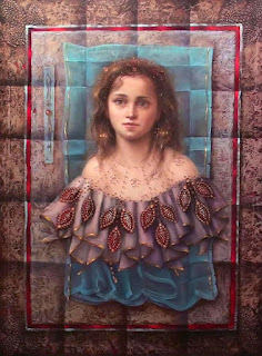
"Living in the Past"
Loretta Fasan owns a Fine Arts degree from Concordia Univertisty.
After working commercially with airbrush for years, she decided to go back to oil painting, and took the time to develop a personal painting style, in between working on music recording.Since 1995 her work has been exhibited in galeries, cultural centers, and small museums in group and solo shows in Canada and the US.
Her paintings have been featured for several years on PBS television, and are in private collections in Europe, Africa, Canada, and the US. She has received 2 honorable mentions from the Quebec Association of Illustrators, and has completed commissions for individuals and for public spaces, she is currently working on a series of paintings of women in mythology.
You can also read Loretta's blog, where you can follow the different stages of her paintings and her artistic career.

"Titania"

Example of trompe l'oeil
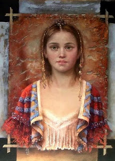
"The Quiet Girl"
Her still lifes entice the viewer to imagine a story beyond the painting itself.
Loretta has kindly accepted to share her thoughts about her work and techniques, as well as the materials that she uses to accomplish her art.
TAI - How do you choose the colours for your monochromatic underpaintings ?
LF - When I decide to use a monochromatic underpainting for a face or skin tones in general, I usually lightly tone the canvas with a warmish color, such as burnt siena, or burnt umber.
Then I use raw umber, ultramarine blue, and black, plus white for the underpainting. Sometimes I add viridian green, if the skin color is going to be light or medium. I do this to counteract the orangey tones of the ground color, which still partly shows through, and to act as a contrast to the pinkish tones which will follow.
The hue of the underpainting colors can vary, somewhat, but it always basically consists of neutrals. The imprimatura can also be a cooler gray. I sometimes base the underpainting color on the subject, and technique ultimately used. If I am planning to use gold leaf, I may use a more intense reddish tone as an imprimatura, to compliment the gold. This red does not usually appear at all in the final work, except for small touches surrounding the gold leaf, but it definitely affects all of the color choices used in the course of the painting.
If I decide to do an underpainting for a still life, I basically use the same colors, without adding the green.

Do you buy your linen already primed, or do you apply the primer (gesso) yourself ?
I buy linen in pre-primed rolls. When working with acrylic primed linen, I add a layer of gesso. I have discovered a compromise that works for me, since I like the strength of the medium grain acrylic-primed linen, but I prefer a smoother surface.
I smooth the surface by adding a layer of gesso using a large palette knife to spread a very light layer of gesso, skimming across the surface weave. This deposits a thin layer of gesso into the crevices of the linen, while avoiding a build-up on the top. I have to work very quickly to blend it because the gesso dries fast. After sanding with fine sandpaper, a smoother surface is achieved with a bit of the weave still visible, while retaining the strength of the thicker linen.
Do you usually use acrylic or oil primed surfaces ?
I have recently bought some oil-primed linen panels, and I plan to try them out.
Have you tried other supports, such as copper ?
If so, how did you prepare them and how satisfied you were with the result ?
I have not used copper, but I have used masonite and wooden panels. I like the smoothness, and the hard support, especially if I am adding texture, or gold leaf.
Do you make a previous study, or do you draw directly onn the support that you are going to paint on ?
I do a very basic drawing just to place the elements, but since I usually work on a somewhat large scale, I find that the proportions and placement have to be changed anyway, so I end up changing a lot of elements on the canvas. I also like to allow for "surprises" or unexpected additions at the end. These touches can end up adding a lot of interest to the final piece.
What is the importance of drawing for you and for your kind of work ?
In the past, I tended to only do drawings, because I felt somewhat intimidated to start paintings . One day, I just decided to just start painting without any preliminary drawings for a while, to get over my anxiety. At this time, I started to incorporate elaborate pattern, and since I was working lifesize, it became impractical to attempt to do a drawing of the whole painting in advance. If I used gold leaf, for example, I had to apply it in the beginning, and work the rest of the painting around it.
I have sanded off, covered, and changed sections of what seemed to be finished portions of the painting, if the final effect required it. I think this adds a lot of richness at the end.
Do you use stand oil by itself or do you also mix it with another medium, such as an alkyd, or eventually with turpentine ?
I mix stand oil with 50% turpentine. I haven't added anything other medium to it so far. I have Venice turpentine, and I plan try to add it in the final layers. I have started using alkyds for the underpainting only, because they dry fast, add body to the final paint film, and can be used to affect oil glazes which are added [see painting underneath].

What role does trump l'oeil plays in your line of work ?
So far, I think I have used trompe l'oeil in a unique, and unexpected way. I have use elements of trompe l'oeil to change the context of the painting, to make some areas appear floating or glued on, or to go from 3-dimensional to flat. Sometimes this breaks the implied realistic illusion, and creates a new illusion.
Which are the positive aspects that glazzing lends to your paintings ?
Glazing allows me to add depth to color or shadows, or to modify a color. I add shadows to the beadwork, for example, at the end, only with a transparent glaze. I also add glazing to the lips and hair.
Of which colours is made your usual palette and which other ones you find yourself reaching for on a regular basis ?
My skin tones are usually composed of: raw umber, burnt umber, terra rosa, yellow ochre, raw siena, ivory black, flake or cremnitz white, alizarin crimson, Indian red, and viridian green. It sounds like a lot of colors, but I don't always use all of them. I just like to have them on the palette.
I might end up using some spare skin tone on the hair, or background. I make warm and cool color strings from these colors. I also use ultramarine blue, transparent red oxide, red and yellow cadmium in my work. I love the quinacridone colors for flowers. I have tried to use it lightly in backgrounds.
Since the internet has taken over as the main showcase for art, one result is that some paintings which are quite strongly colorful, yet appealing when when viewed in person, can appear "loud" or garish on the internet. This is especially the case when primary colors are used. Monitors can show colors differently, and no camera can see into shadows, or react to color as a person can.
Tell us about your favourite brushes (kind, shape and sizes) and in which stages/parts of your work you use them.
I use both bristle and synthetic sable-type brushes. My favorite shape is filbert. I also use flat bristle brushes for laying in colors quickly. I sometimes use a semi-stiff large sable to blend on the neck, shoulders, etc. I use filberts on the face and figure.
If the face is life-size, I use medium-sized filberts for the main areas, and smaller brushes for the eyes, and nose, etc. I try to lay in the brush strokes in all directions, but I end up with vertical strokes at the end. I use a large fan-shaped synthetic sable to lightly stroke down to get rid of directional ridges which tend to catch the light, and are distracting.
I sometimes use a splayed-out sable to lightly add blush in a random way, to the lips, nose or cheeks. I use various sizes, from large to very tiny. I also use fan-shaped bristle brushes for the background or sky.
Can you tell us what kind of frames go well with your painting stlye and subjects ?
I have used all kinds of frames, from elaborate to real antiques, brushed steel, and even found frames which I have worked on, including recycled objects used as frames. I have 2 Renaissance-style frames recycled from the speaker fronts of a vintage TV found in a barn! [jpg of this frame included in email] I like to buy frames, and have them on hand, then, as I work on the paintings, I can test how they will look in the frames. Sometimes, you can find great frames in very large sizes at home decor stores. Unique hand-finished styles. They usually come with mirrors in them, but are of the same quality as the more expensive custom frames sold in framing stores. I have tended to choose well-made solid, classic frames, which are suitable to various types of decor. I do tend to prefer linen liners, which almost always seem to enhance the look of the painting. Linen liners set the painting apart from the frame, and give it breathing space. Without liners, frames can cast shadows onto the painting, and sometimes appear to confine the painting.

How would you define your work and how has your art evolved to reach this stage ?
My painting style and subject matter is evolving. I will describe what I've tried to do so far. My goal was to create a sense of richness and impact creating female faces as icons, while incorporating a strong graphic aspect.
I was attracted to pattern, decoration, and flatness, and at the same time, to certain aspects of realism. I have been working to combine all of this , and, recently, to get the rich colorful elements to also appear worn, and aged. There is an element of trompe l'oeil, also. Parts of the figure can appear to flatten, and the background goes from atmospheric to a texture with folds. I tend keep the mood of the paintings positive, even if there is a moody element. I am inspired by many artists, both past and present. Currently, I am reducing the scale of the imagery away from lifesize, to allow for complete figures, and more of the surrounding space. [Detail from Quiet Girl (underneath); Titania; Example of trompe l'oeil; Quiet Girl ]

Do you accept commissions ?
I have done some commissions in the past. It would depend on the individual proposal. Obviously, I would prefer to work on a project that would suit my style.
Are you available for workshops or painting lessons, if someone should be interested in learning more with you ?
I would be available for workshops, to explain fundamentals, or metal-leaf technique.
Are there any planned exhibitions for the near future ?
At the moment, I have many paintings-in-progress that are at the 70-80 % finished stage, which I need to complete. I would like to have a decent body of finished, framed work put aside, so I don't feel pressured to complete work specifically for a show. Many galleries have closed, including some in which my work has been shown. I will use the internet to show my work for now, and will probably enter my work in some group shows.

"Living in the Past"
Loretta Fasan owns a Fine Arts degree from Concordia Univertisty.
After working commercially with airbrush for years, she decided to go back to oil painting, and took the time to develop a personal painting style, in between working on music recording.Since 1995 her work has been exhibited in galeries, cultural centers, and small museums in group and solo shows in Canada and the US.
Her paintings have been featured for several years on PBS television, and are in private collections in Europe, Africa, Canada, and the US. She has received 2 honorable mentions from the Quebec Association of Illustrators, and has completed commissions for individuals and for public spaces, she is currently working on a series of paintings of women in mythology.
You can also read Loretta's blog, where you can follow the different stages of her paintings and her artistic career.

"Titania"

Example of trompe l'oeil

"The Quiet Girl"
Friday, March 28, 2008
The Art of Zac Freeman

Zac Freeman is a fine artist who works with several media.
He owns a B.F.A. from the Jacksonville University with cum laude and departmental honors and his art has been exhibited, among other places, at the Museum of Contemporary Art (Jacksonville), Chester Gallery (Chester, CT) and Miami Museum of Science and Space.
His work is part of the Art collection of The Regency Group ( Florida).
The quality of Zac Freeman's Art has granted him a well deserved recognition and has been featured on several publications.
Although as mentioned before he uses several media, I believe that the "Disposable" portraits collection made with junk, trash and disposable goods may be considered his ex libris.
He owns a B.F.A. from the Jacksonville University with cum laude and departmental honors and his art has been exhibited, among other places, at the Museum of Contemporary Art (Jacksonville), Chester Gallery (Chester, CT) and Miami Museum of Science and Space.
His work is part of the Art collection of The Regency Group ( Florida).
The quality of Zac Freeman's Art has granted him a well deserved recognition and has been featured on several publications.
Although as mentioned before he uses several media, I believe that the "Disposable" portraits collection made with junk, trash and disposable goods may be considered his ex libris.
Sunday, January 20, 2008
Wonderful Sculptures by Richard MacDonald
In the world of Arts there are great talents.
Richard MacDonald is one of them.
His sculptures, inspired by the well known Cirque du Soleil are of a unique beauty.
Other themes include Mythology, Ballet, Heroics and Monuments.

Richard MacDonald is one of them.
His sculptures, inspired by the well known Cirque du Soleil are of a unique beauty.
Other themes include Mythology, Ballet, Heroics and Monuments.
Subscribe to:
Posts (Atom)